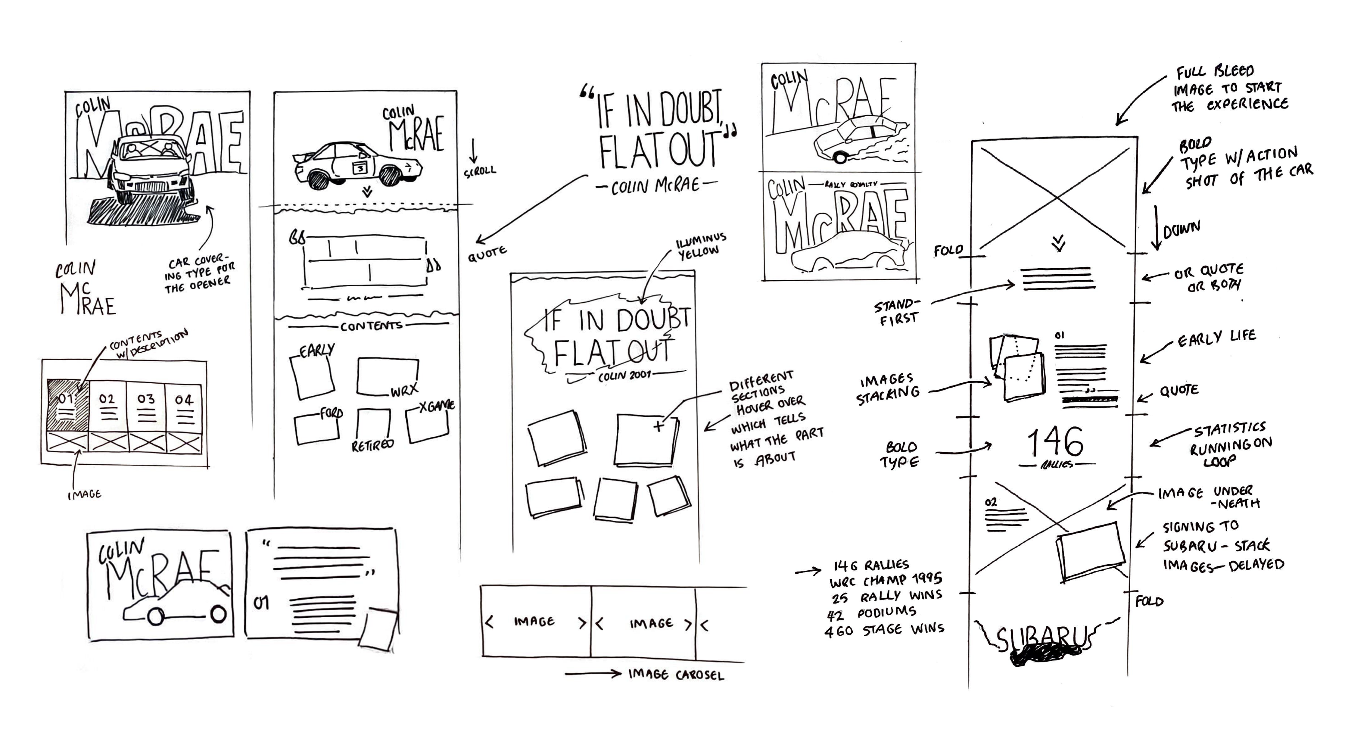
Colin McRae Digital UX
A fully interactive digital web experience on the story of the rally legend Colin McRae. The experience reflects design styles from the 80’s and 90’s and uses rally liverys and colour schemes from McRaes career to influence the design of the piece. Sourcing the content for this project was a big part of the process and I managed to uncover photography not just of the racing but photos of Colin with his family and Co-driver Nicky Grist. I also sourced footage which goes along with the story, taking famous moments of his career which adds another layer to the users experience when viewing the project.
All the development and wireframing were created in Figma and the final project was designed in Ceros. To view the full experience click here.
Work:
UI/UX design
All the development and wireframing were created in Figma and the final project was designed in Ceros. To view the full experience click here.
Work:
UI/UX design


Japanese Sumo
Below are two editorial spreads I’ve designed about Japanese Sumo Wrestling. I have created them with a clean and simplistic style and given a detailed typesetting treatment to the bodycopy of the article. The screenshots below showcase how I’m utalising my grid structure and lining up all the elements on the page.
Work:
Print/Editorial design
Work:
Print/Editorial design


Shotgun Magazine
Shotgun is a high end automotive magazine that celebrates people’s stories and their connections they have with their cars. The publication is meticulously typeset with combinations of large bold typography which is paired with high quality imagery.
Below you can see the front and back cover of this issue, followed by a hand picked selection of my favourite spreads.
Work:
Print/Editorial design, typography
Below you can see the front and back cover of this issue, followed by a hand picked selection of my favourite spreads.
Work:
Print/Editorial design, typography


Barbican Posterzine
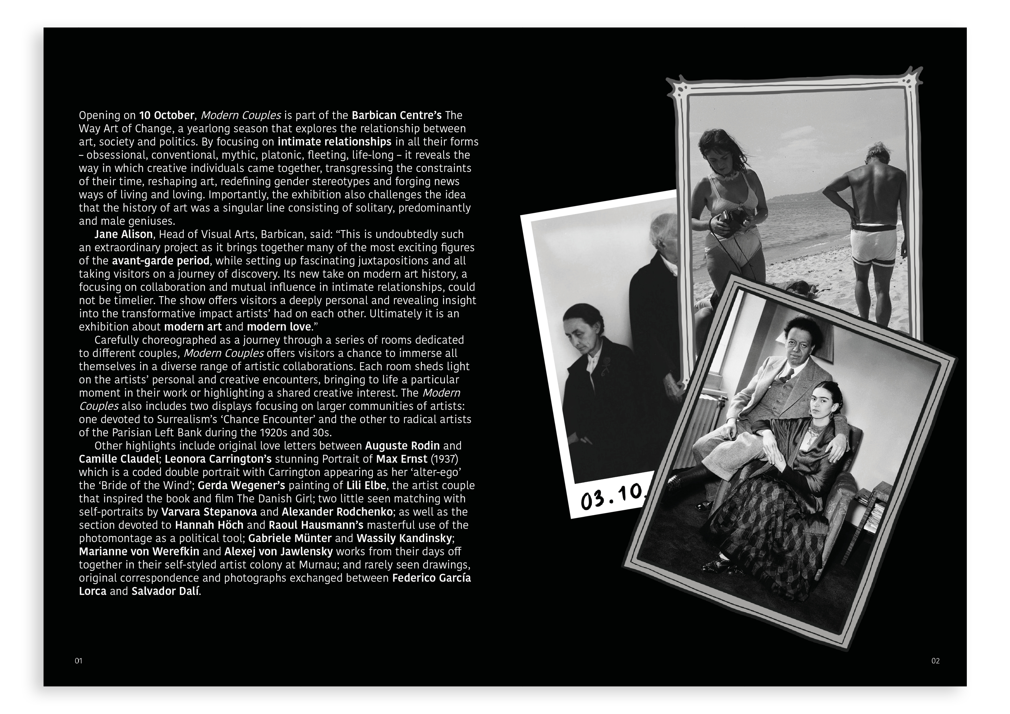
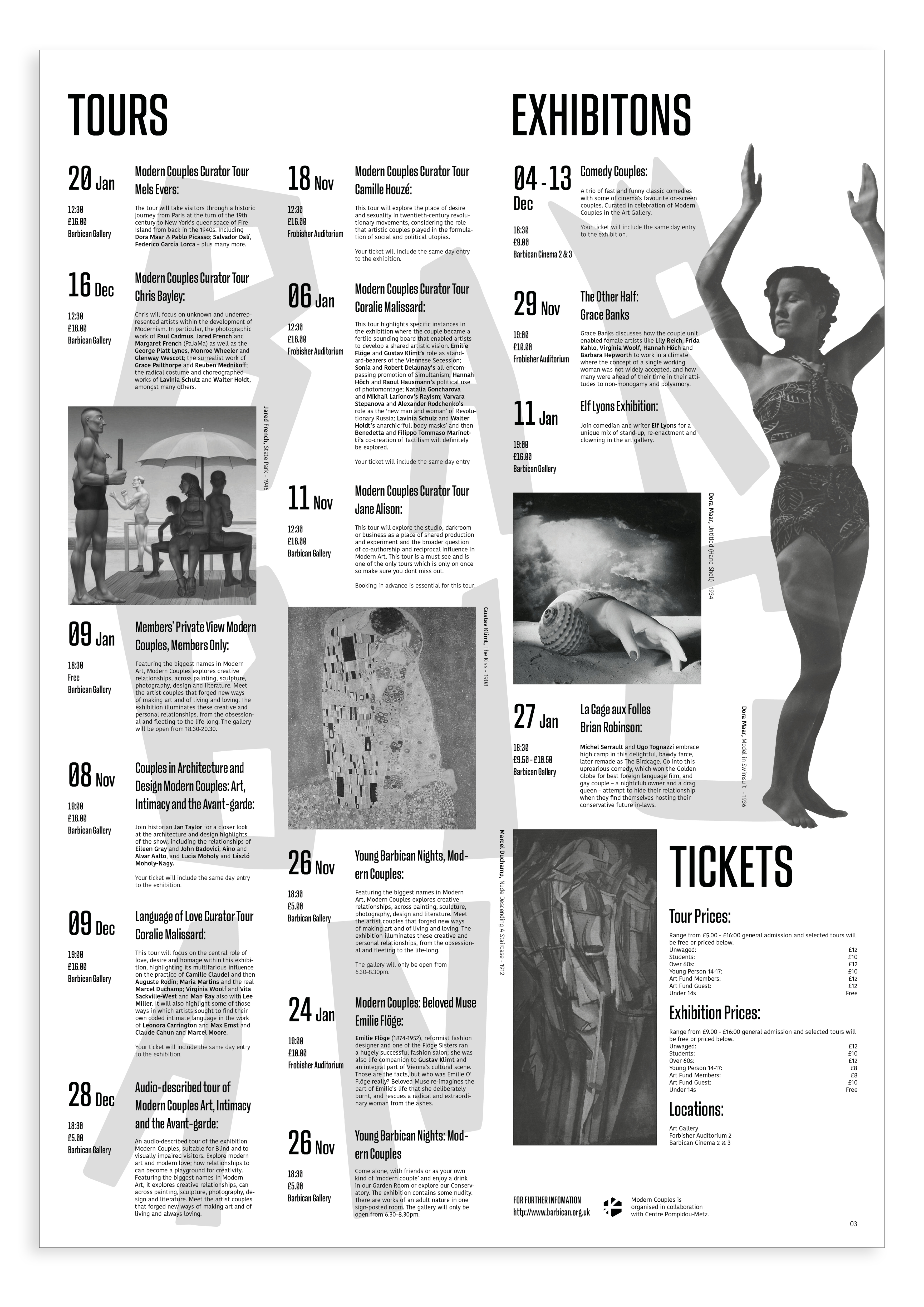
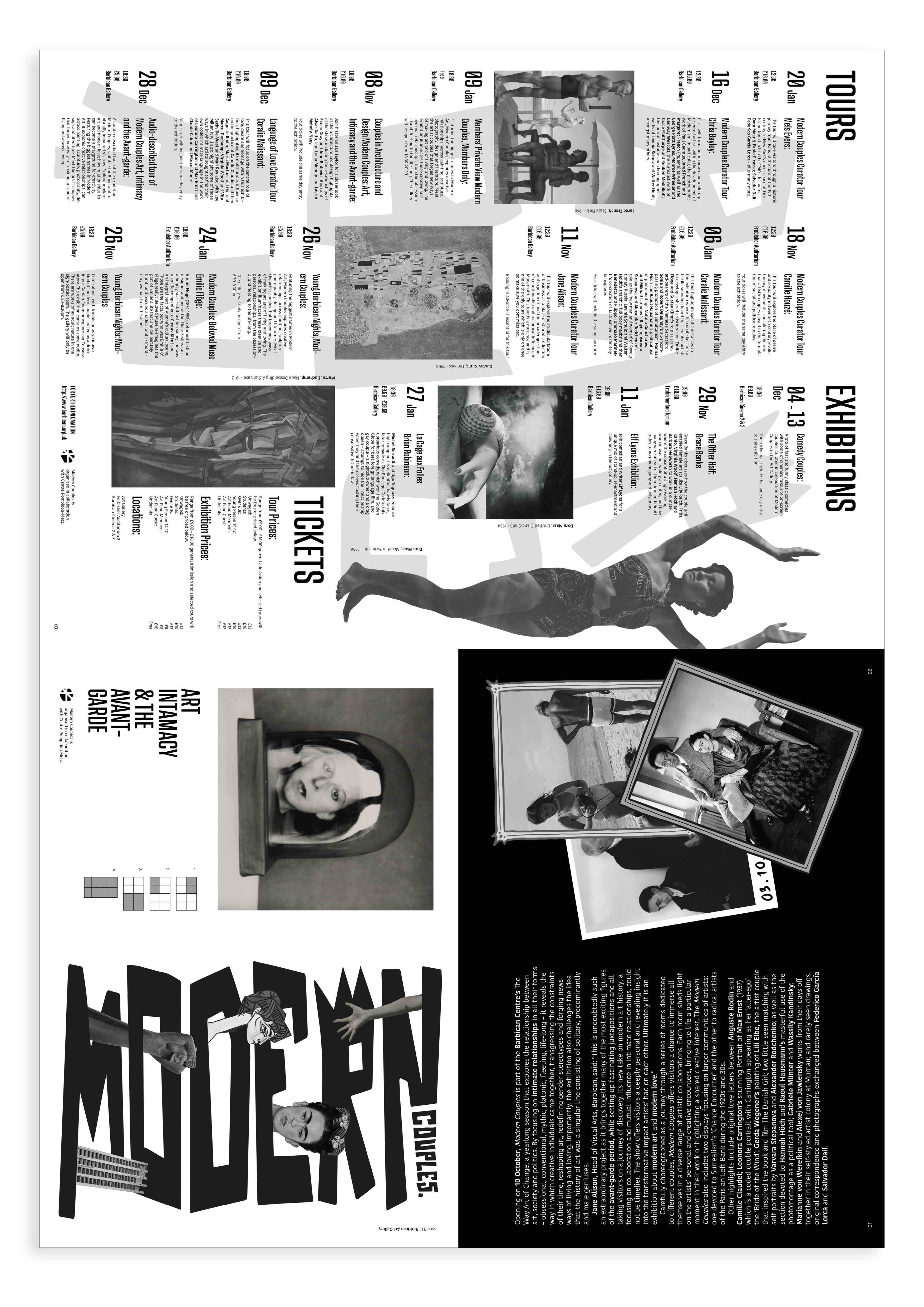
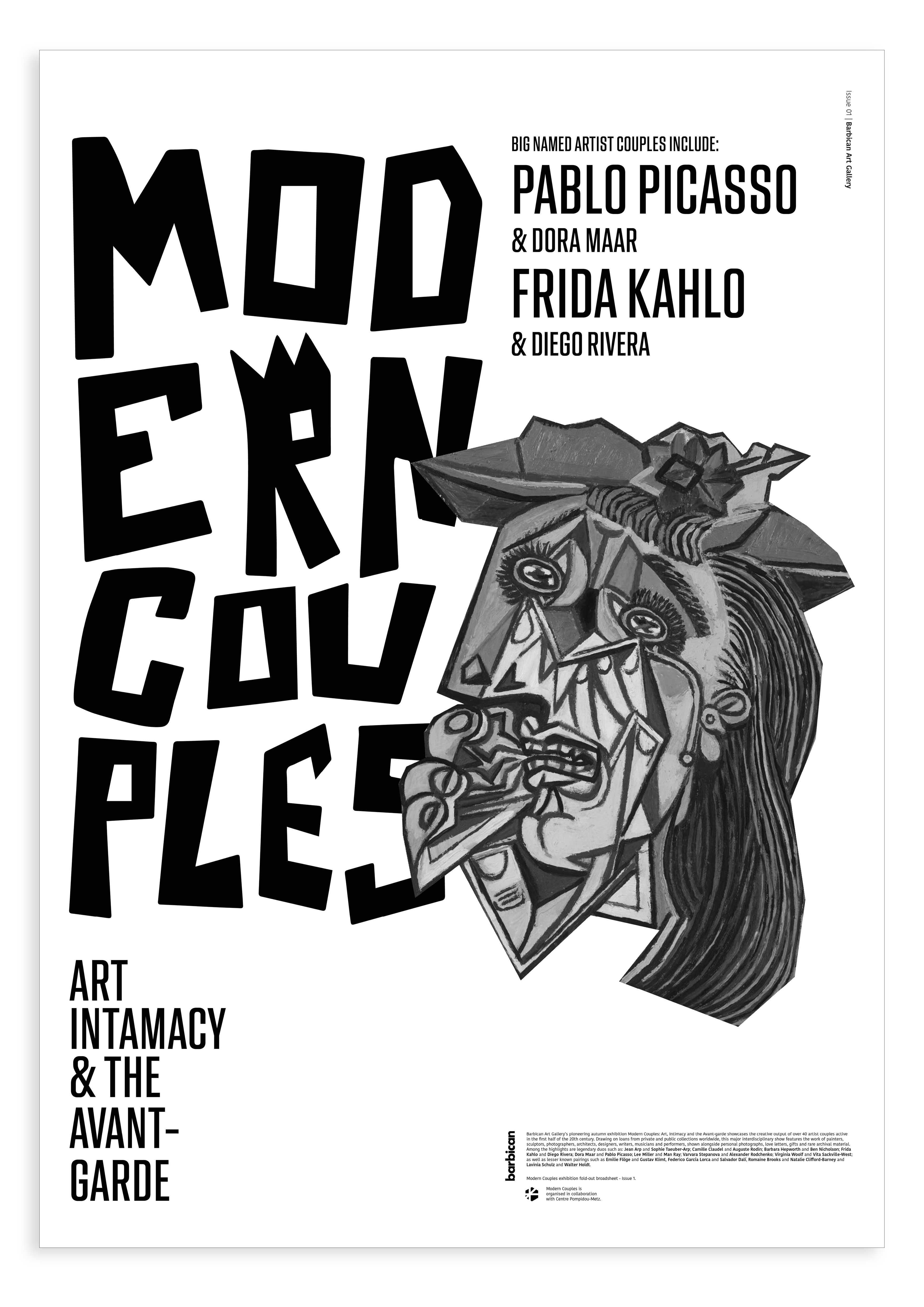
The brief for this project was to create a museum broadsheet for the Barbican in London for an upcoming exhibition called Modern Couples all about famous artist couples. The idea behind the broadsheet is that it would be available on arrival to the Barbican so therefore I wanted to design it to fold up neatly. Directly below are the front and back cover and on the back there is a diagram to show how the fold works. As you open up the broadsheet you are greeted with an opening double spread giving context to the exhibition and then after that a page with all the key information needed to navigate the exhibition, followed by an A2 poster on the back.
The design of the broadsheets imagery has a collaged theme which is paired with hand drawn typography and utilises type hierarchy to represent the information well.
Work:
Print design, typography
The design of the broadsheets imagery has a collaged theme which is paired with hand drawn typography and utilises type hierarchy to represent the information well.
Work:
Print design, typography


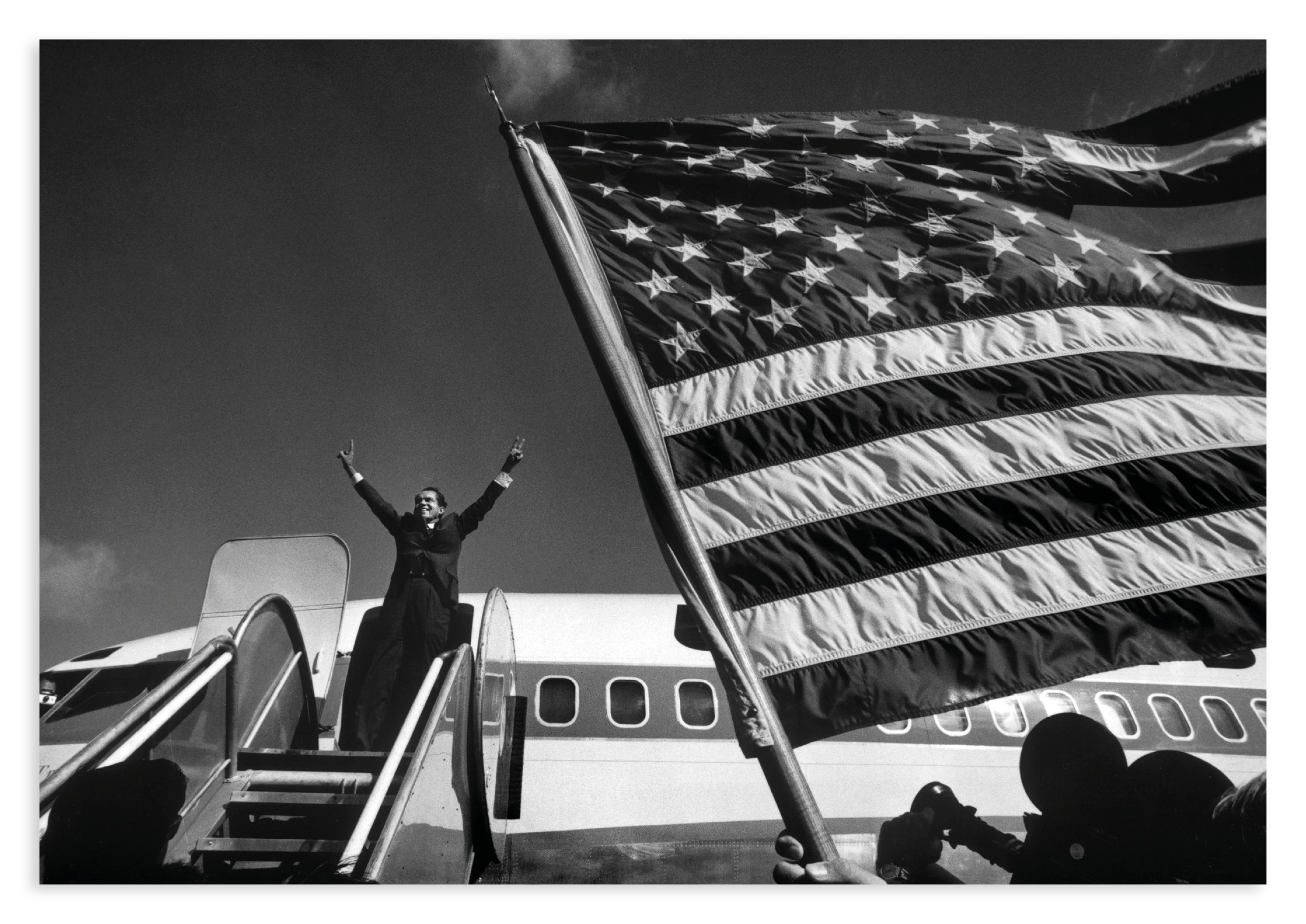
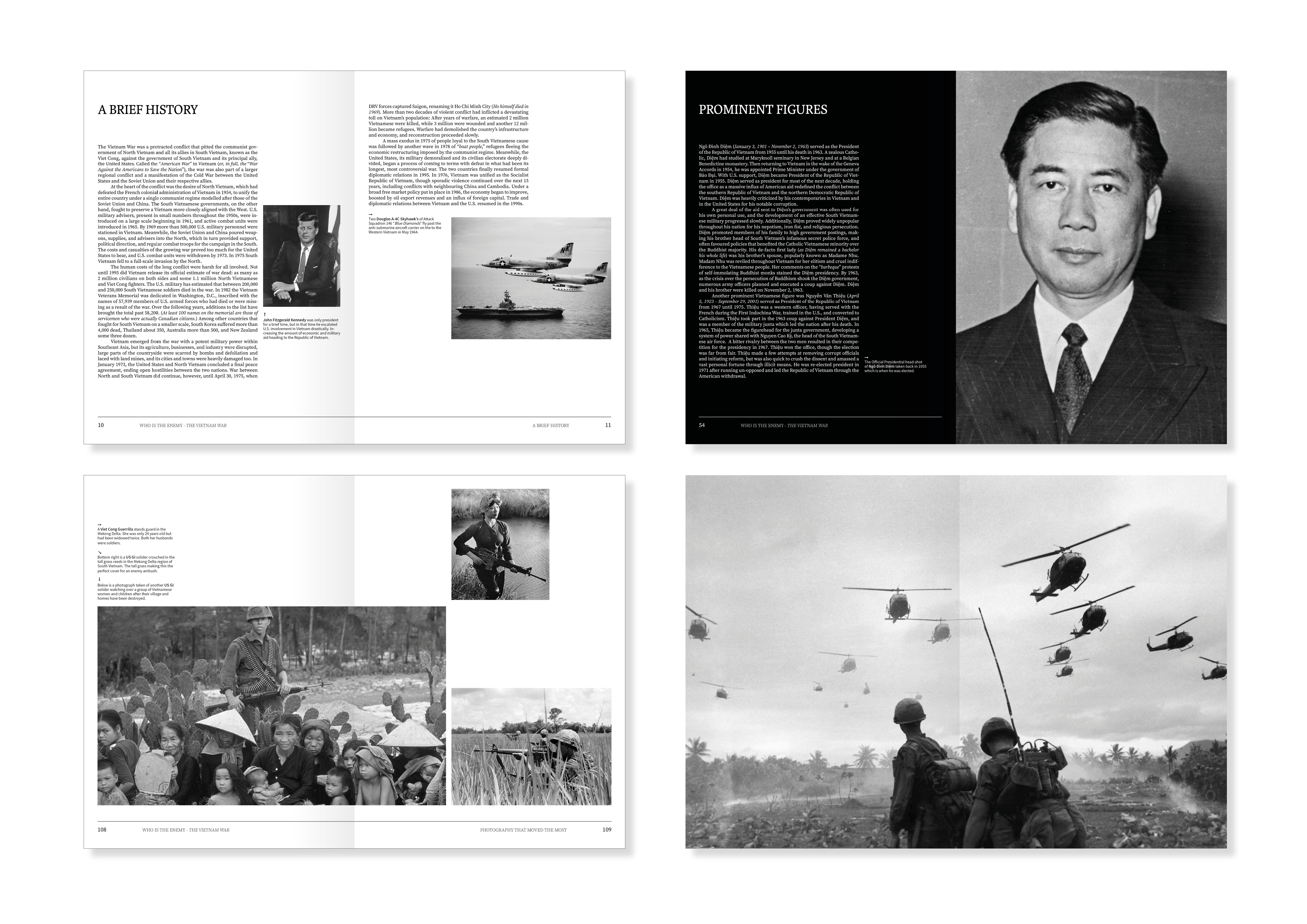
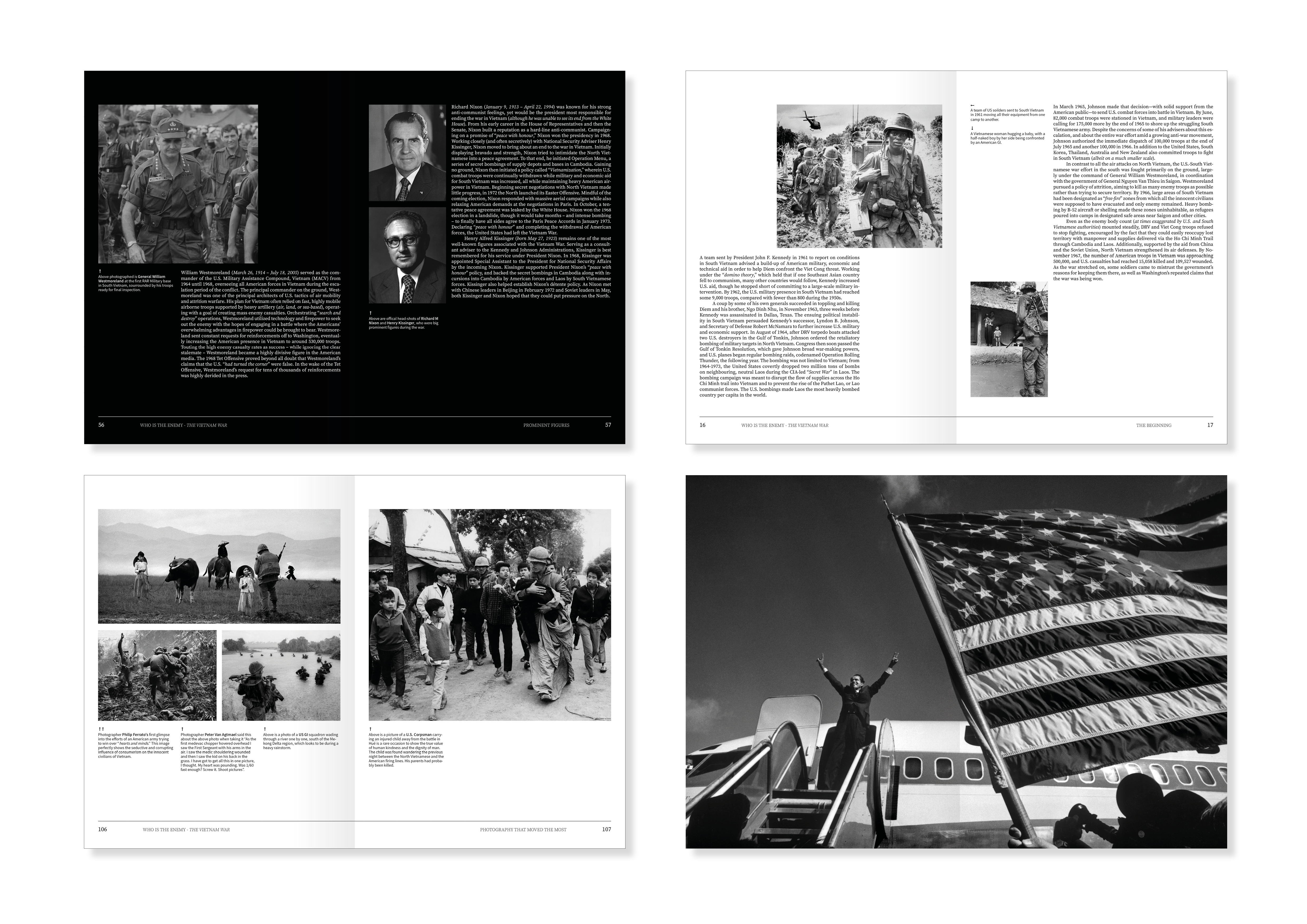
Who Is The Enemy
This project is a hardback book proposal on the Vietnam War. It includes striking imagery paired with a sober black and white design on the inside to represent the good and evil of war. The whole book includes justified long form text with a mix of three different typefaces for the headings, body copy and captions. The imagery on the cover reflects the suggestive nature of the title.
Work:
Book design
Work:
Book design